You Get Eight Seconds. Make Them Count.
I read somewhere recently that it’s been scientifically proven that today’s average attention span is eight seconds long. I’d cite the source, but I apparently got distracted and…look…squirrel!
(Actually, the source is Microsoft Corp., which along with some Canadian researchers set out to prove that an increasingly digitized life is dramatically affecting our ability to concentrate. They were right. The average attention span dropped from 12 seconds to eight in the last 15 years.)
Eight seconds. Our ability to learn, retain, analyze and judge has been reduced to the amount of time a professional rodeo bull rider has to hang on for dear life (if he’s lucky). Never mind the implications for teachers or medical personnel trying to shape minds and save lives – what about those of us just trying to rally support or clarify an issue or (gasp!) differentiate a product or service from its competitors? How can we break through if our audiences aren’t there long enough to even break in?
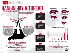
This is an example of an “issuegraphic” from the World Wildlife Fund.
Enter the issuegraphic. (Okay, I made that term up, but I’m coining it. You heard it here first.)
Taking advantage of what’s called the pictorial superiority effect – where researchers credit the use of images with increasing memory retention and learning by more than 50 percent over words alone – an issuegraphic is a spin on the tried-and-true infographic. It not only conveys necessary information at a glance but also may use comparative, analogous and even completely unrelated correlations to make a persuasive case for joining a movement or thinking differently about an issue. It can even offer immediate ways the reader (or should I say viewer?) can impact change. All in a few measly seconds.
One can absorb, form an opinion, take action, and then get back to one’s Netflix-binge-watching, Instagram-scrolling, email-responding life (after hitting “like” and “share,” of course).
Complexity Visually Deconstructed
Our agency works with the largest social-service organization in the world, The Salvation Army. They serve over 30 million people a year in the U.S. That’s one person every second of every day. And they serve them in hundreds of ways. Every ZIP code in America has a different set of needs – homelessness, addiction, utility assistance, after-school care and job training, to name a few – and The Salvation Army tailors its programs to the needs of each community.
Our challenge, as their national communications and advertising firm, is explaining what they do in a way that sticks. And we have to do it fast –- the vast majority of fundraising happens between Thanksgiving and Christmas Eve during The Salvation Army’s annual Red Kettle Campaign.
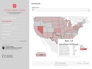
The Human Needs Index captures the information in a single image.
One way we distill the myriad programs and validate the critical state of poverty is through the recently launched Human Needs Index –- an exhaustive measure of seven key indicators of poverty, over time and geography. White papers abound, with reams of data for those who care to know, but the Human Needs Index itself is captured in a single, visual, interactive image. The state of need is clear.
A Problem Well Painted
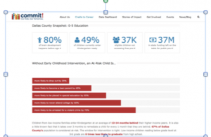
Dallas’ Commit! Partnership must identify, correlate, and communicate complex issues.
Closer to home, Dallas’ Commit! Partnership – a coalition of 160 institutions – must identify, correlate, and communicate complex issues related to the declining educational outcomes of Dallas County’s more than 750,000 students. With a goal of implementing meaningful systemic, regional and place-based initiatives, supporters need to understand the roots of the problem, their correlation to outcomes later in life, and the potential for different outcomes with implemented change.
For an agency half full of English and journalism majors, it’s a shift in how we communicate as marketers for sure. So much so, we’ve added team members specifically dedicated to data visualization and animation, as well as technology tools to capture, analyze and correlate relationships in image-friendly ways.
Whether for galvanizing support for a cause or simply moving a customer further along the sales cycle, communication in any form is about telling a story. Yet, ironically, telling a story today is ever less about the words. It’s all about making your case with visual impact –- in eight seconds flat.
Barnett will be writing her next column in issuegraphic form.
For a daily dose of what’s new and next in Dallas-Fort Worth innovation, subscribe to our Dallas Innovates e-newsletter.
R E A D N E X T
-
Famous for flip flops, Hari Mari has made its first flagship store a laid-back retreat—with a bar, yoga classes, and second-floor party space.
-
The Water Cooler at Pegasus Park—the largest shared nonprofit space in Texas — is a place designed to accelerate impact, together. From Big Thought to SVP Dallas to The Trust for Public Land, the 15 ‘exceptional nonprofits' were picked after an application process last summer. They’ll join Water Cooler's five founding tenants.
-
You'll also read about the FC Dallas Foundation opening a soccer field for My Possibilities, Hari Mari partnering with St. Jude's, North Texas Food Bank Starts Its New $500M Campaign, and more organizations making a difference in Dallas-Fort Worth right now.
-
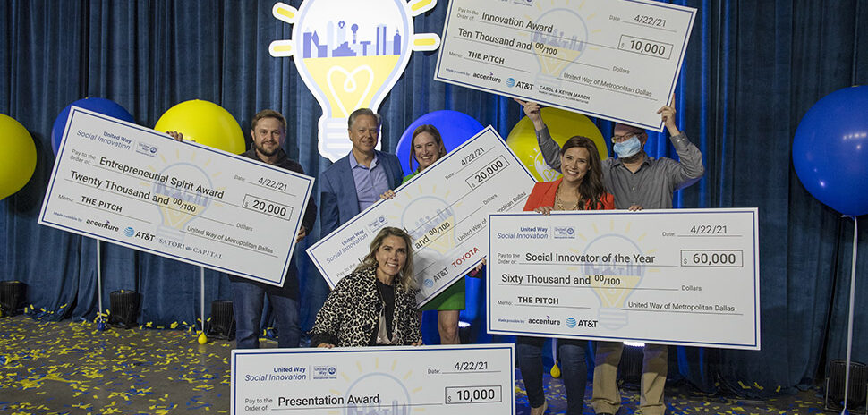
At United Way of Metropolitan Dallas' fifth annual social innovation competition, local staffing agency for second chances Cornbread Hustle won $145,000 in funding. Also announced was United Way's plans to expand its social innovation work in North Texas with a new incubator program exclusively for women and entrepreneurs of color.
-
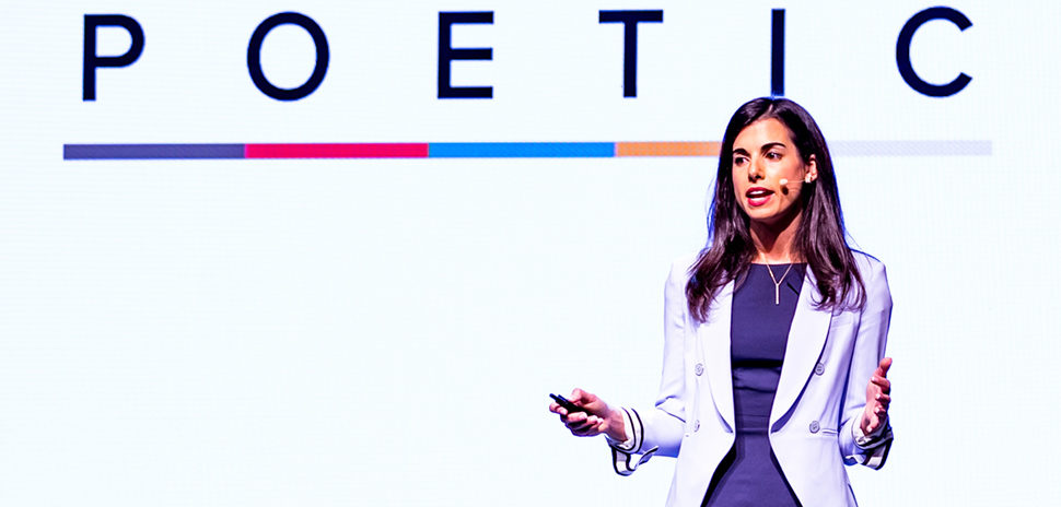
Dallas-based POETIC, an aftercare program dedicated to supporting vulnerable youth, is continuing its partnership with the Texas Bar Foundation to enhance its programs and aid its goal to end child exploitation and trafficking in the community.